Credits: Article and images by Tamim Almousa @ Quill & Pad. See the original article here - https://quillandpad.com/2024/06/07/the-case-against-watch-lume-its-weak-sauce-and-heres-why/
—————————————————————————————————–
Neither can I make the time out when I wake up in the middle of the night, no matter how hard I squint, even though my eyesight isn’t even half bad. I understand that laying the watch down, dial side up, underneath a bright bulb for a while would help the lume retain its glow, but who wants to do that before going to bed each night? “I’ll be right there, honey, ‘soon as I’m done harvesting light!”

Panerai Radiomir Otto Giorni
Functionality aside, if only for the sake of tradition rather than application, lume does make sense on a wide range of sports pieces and dive watches in particular, playing a big role aesthetically. It’s hard to imagine a Panerai Radiomir or Blancpain Fifty Fathoms without it—and for good reason: lume is integral to the genre and (as Mosso would say) true to history.
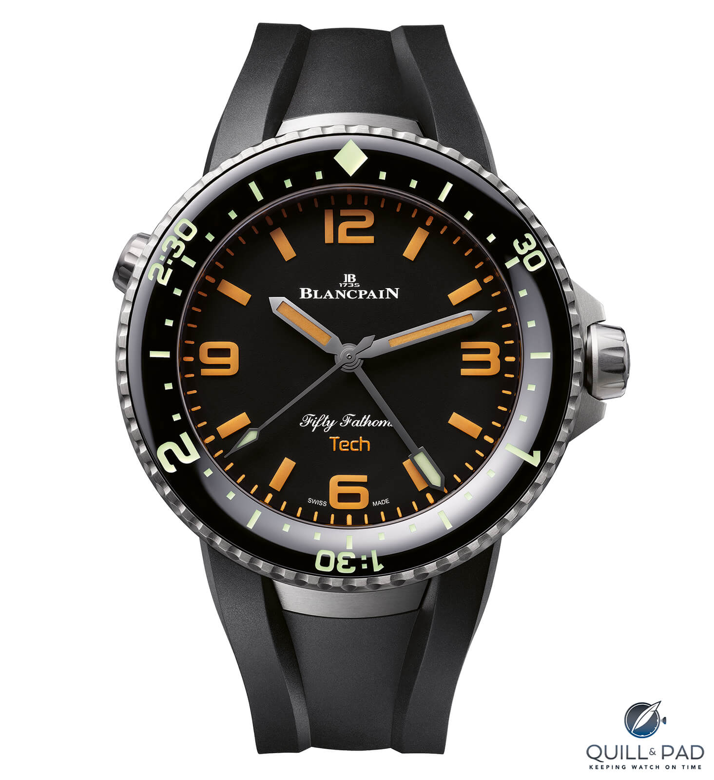
Blancpain Fifty Fathoms Tech Gombessa
On high-end, dress pieces, however, not so much. Here, the addition of lume clashes with the baroque, artisanal, and classical cadence of such things, especially when used to excess.
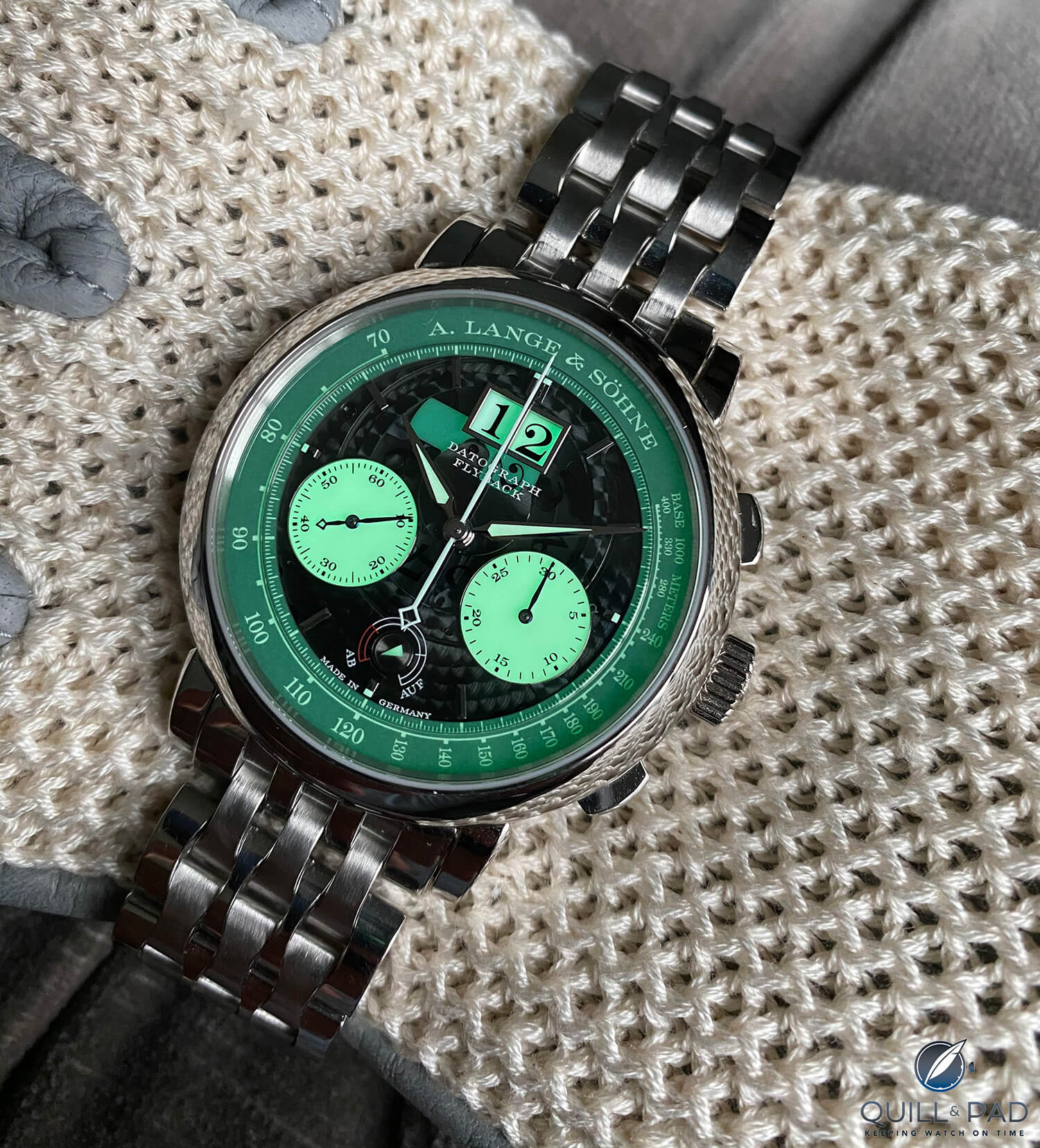
Finished product: uniquely fitted Wellendorff bracelet, Lange Datograph Lumen (photo courtesy CB)
Drenching a Datograph’s dial, or any Lange’s, for that matter, with the stuff is like dipping bluefin tuna in mayo or sriracha—criminal.
Same goes for dressy sports watches. Lume will ruin anything dressy, or at least take it down a notch, no matter how sparsely sprinkled in.
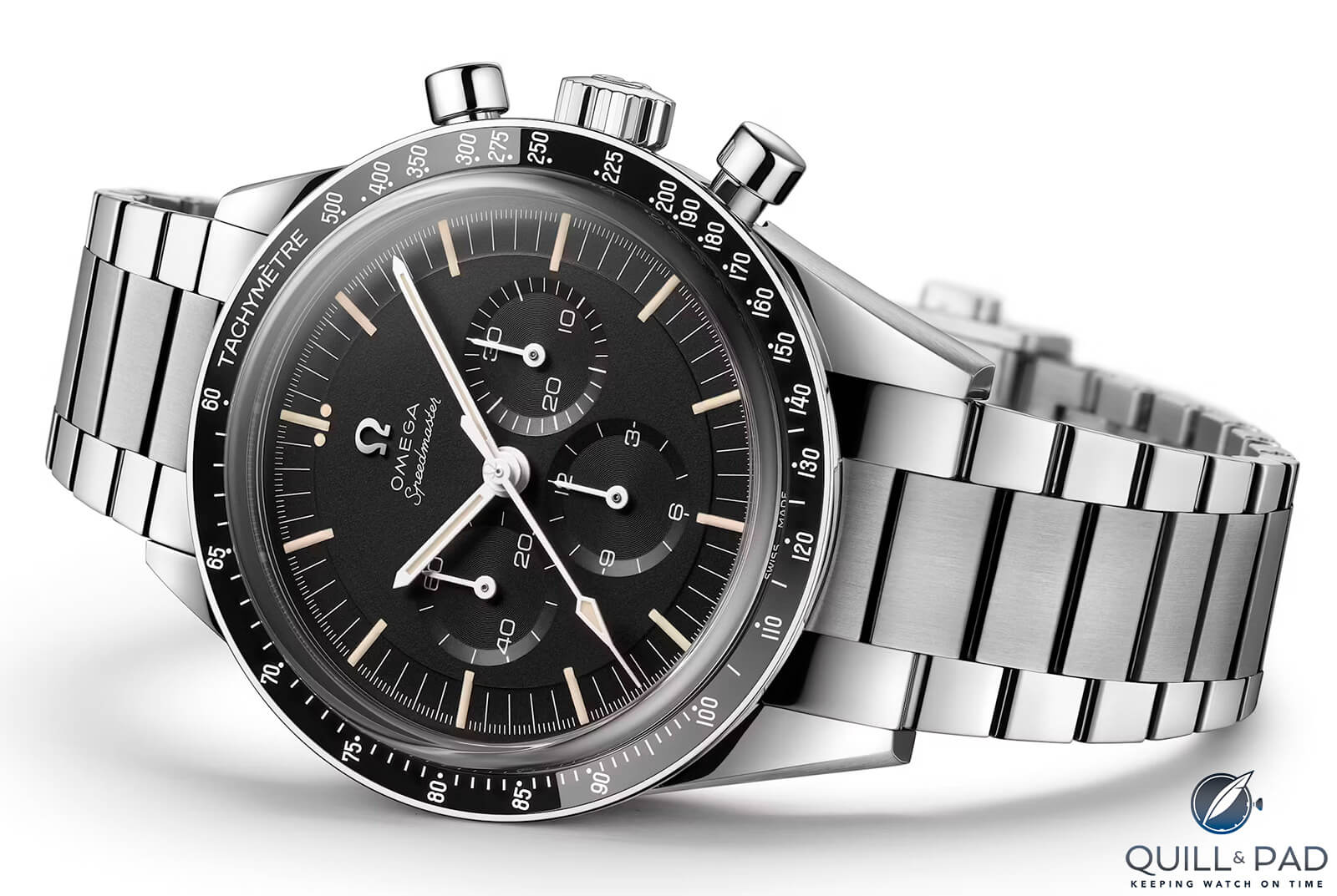
Omega Speedmaster “Ed White” 321
Case in point: the Speedmaster “Ed White” 321. Its indices are of the unfortunate “fauxtina” variant, a new substance made to look old, meant to take us back to simpler times. You know, when female factory workers were encouraged to lick the tips of radium-soaked paint brushes, causing their jaws to crumble.
Alas, I digress. Consider again the Ed White. Close your eyes for a second and substitute the sickly, lumpy lume, which is about as palatable as a turtle’s taint, with fresh white paint that matches the rest of the dial’s details. Now, isn’t that better? What you have there is an honest-to-God, good-looking watch, clean and pristine.
I don’t know about you, but a greenish-yellowish color scheme doesn’t exactly scream moon landing to me. Save it for your Hamilton Khakis and the like.
—————————————————————————————————–
Credits: Article and images by Tamim Almousa @ Quill & Pad. See the original article here - https://quillandpad.com/2024/06/07/the-case-against-watch-lume-its-weak-sauce-and-heres-why/