Credits: Article and images by @ Quill & Pad. See the original article here - https://quillandpad.com/2024/09/14/watch-design-originality-similarity-or-imitation/
—————————————————————————————————–
Haven’t I seen you somewhere before?
On the spectrum of mainstream brands from masters of uniqueness to slavish imitators, I’m afraid that to my eye Girard-Perregaux lives closer to the latter end of the scale than to the former.
To its credit, Girard-Perregaux has one landmark design: the instantly recognizable Three Bridges tourbillon design and all of its variants.
But when I look at the Cat’s Eye series (first introduced in 2004), I immediately see the AudemarsPiguet Millenary, and for the vertical versions of the oblong Cat’s Eye, a less compelling version of Breguet’s Reine de Naples.
The WW.TC calls to mind every other watch based on the Louis Cottier world time system; and the 1966 collection calendar and moon phase watches fairly scream “Patek Reference 2448,” but with the indications awkwardly crunched into the center of the dial.
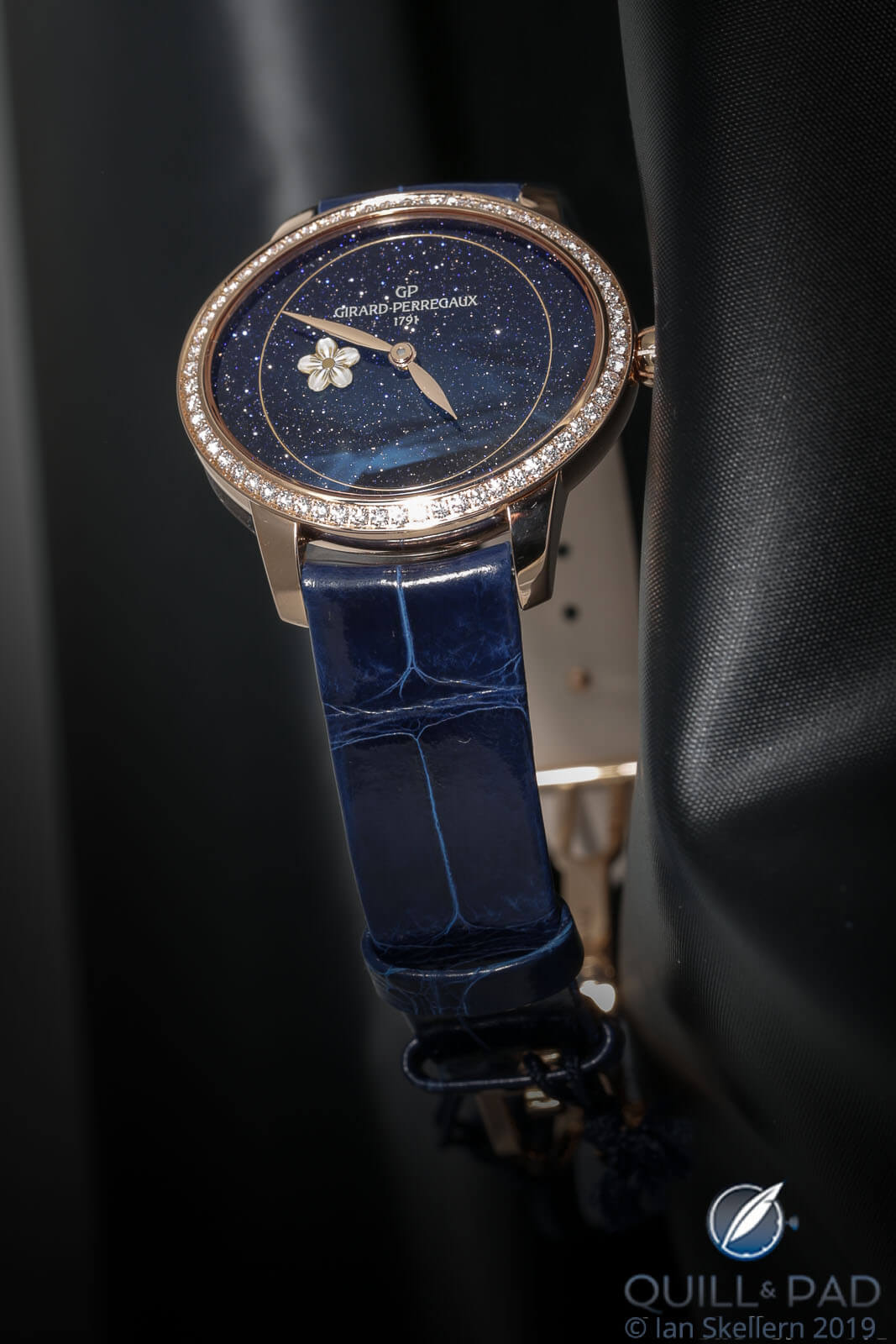
Girard-Perregaux Cat’s Eye with aventurine dial
Then there’s the Laureato series, widely decried upon its 2017 re-introduction as a watered-down clone of the Royal Oak. While Girard-Perregaux was quick to point out that the hexagonal bezel and integrated bracelet of the new versions were taken from its own original Laureato of 1975, I think that it would also be fair to suspect that the 1975 watch, designed by a Milanese architect, was itself somewhat based on Gérald Genta’s Royal Oak design that had been introduced three years earlier.
Regardless, I’m calling shenanigans once again based on the GaryG Styling Statute of Limitations, which dictates that coming out with a watch this similar to the Royal Oak after this long a hiatus isn’t originality. It’s imitation.
The elephant in the watch box
All of which, of course, brings us to the controversy of the day: the perception among many watch buyers and enthusiasts that we’ve seen far too many similar steel sport watches, many with blue dials, introduced over the past few years.
It’s gotten to the point at which online commentators have started creating visual displays of as many of these pieces as they can find, such as the one below.

Family resemblance? A recent inventory of blue-dialed steel sport watches (photo courtesy @dailywatch Instagram)
By my reckoning, some of these pieces are “too similar” while others are not!
I’ve already opined on the Girard-Perregaux and Bulgari, and I’ll grandfather the Royal Oak, IWC Ingenieur, and Patek Philippe Nautilus as being direct descendants of the original Gérald Genta designs, and the Rolex and Cartier for being true to their original versions as well.
The Hublot with its flat, screwed bezel has always seemed Royal-Oakish to me; and while I saw the new Chopard Alpine Eagle recently and liked it, I have to confess that on inspection the AP-style screws and Nautilus-style ears make me understand some of the criticisms that have come its way.
I think that over the past years Vacheron Constantin has established its own recognizable (and attractive) design language for the Overseas based on the Maltese cross, and the Aikon from Maurice Lacroix is a tweener for me as it doesn’t obviously parrot the category leaders.
For the life of me I don’t understand why some folks have labeled the Bell & Ross BR 05 as a Royal Oak clone; while I’m not a likely buyer for the watch, it looks a lot more like a classic B&R to me than anything else, Nautilus-style bracelet notwithstanding.
—————————————————————————————————–
Credits: Article and images by @ Quill & Pad. See the original article here - https://quillandpad.com/2024/09/14/watch-design-originality-similarity-or-imitation/


