Credits: Article and images by Ian Skellern @ Quill & Pad. See the original article here - https://quillandpad.com/2024/10/05/behind-the-lens-two-1815-chronographs-from-a-lange-sohne-3/
—————————————————————————————————–
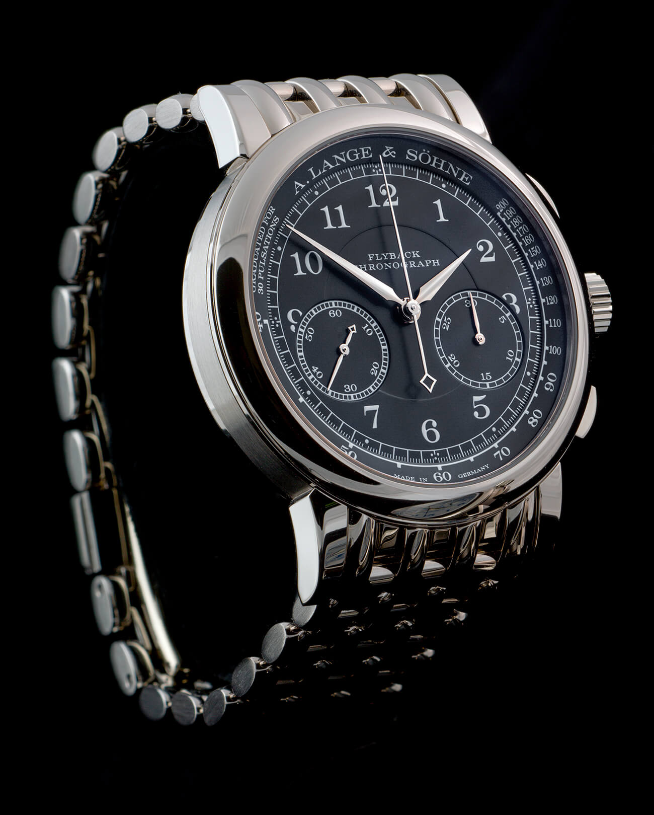
Real presence: A. Lange & Söhne 1815 Chronograph on bracelet
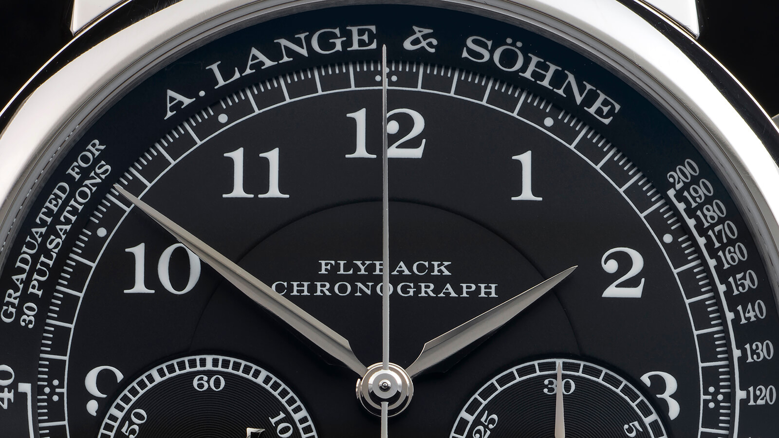
I’ve read that some folks think the all-black treatment makes this watch a bit too “Patek Philippe-like” in the vein of Reference 5370P and particularly Reference 5170G. I’ll confess that I can see the point, but at the same time the distinctive fonts used and design codes such as the three-dot markers at 12, 3, 6, and 9 make this piece unmistakably Lange-like for me.
Layers in the darkness: dial detail, A. Lange & Söhne 1815 Chronograph
While the black-dialed version obviously lacks the color contrasts of the Boutique Edition, it has its own visual interest with the dial on four distinct layers (pulsometer, hour and minute ring, central dial, and subdials) and light-catching circular grooves on the subdials themselves.
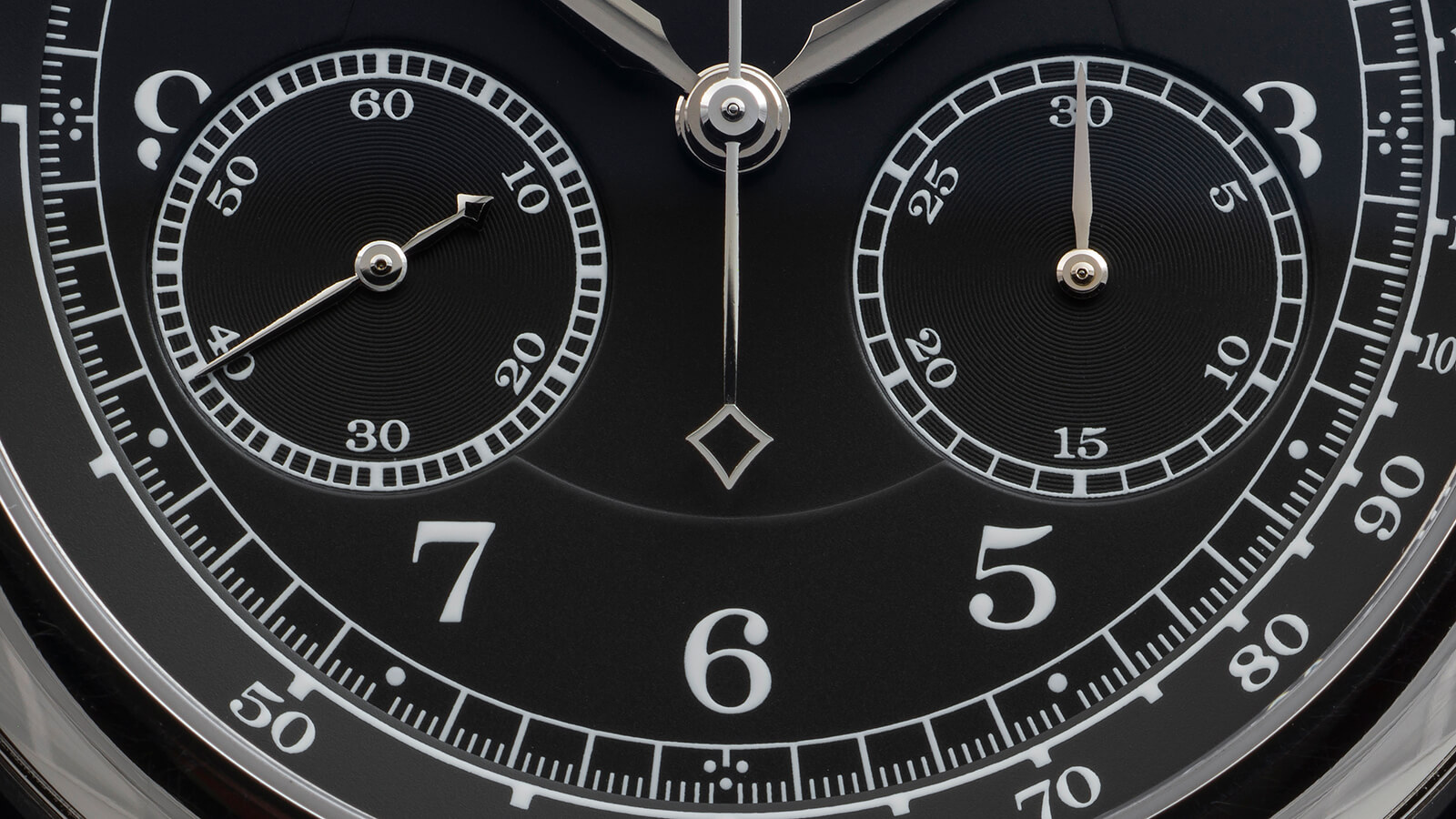
Feeling groovy: dial detail, A. Lange & Söhne 1815 Chronograph
Around back of both watches it’s what we’ve come to expect from an A. Lange & Söhne chronograph: a tiny, finely detailed city under glass featuring a wide array of finishing techniques that invite the eye to linger while we operate the pushers and watch the chronograph movement do its tricks.
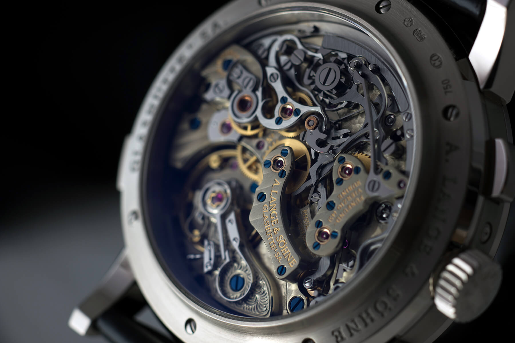
Caliber L952.1 of the A. Lange & Söhne 1815 Chronograph
Shooting the A. Lange & Söhne 1815 Chronographs
If you’d asked me before I set up the light tent to shoot these two beauties, I’d have guessed that the black-dialed white-metal watch would give me fits and the Boutique Edition with its largely matte-textured dial and clear color contrasts would be straightforward.
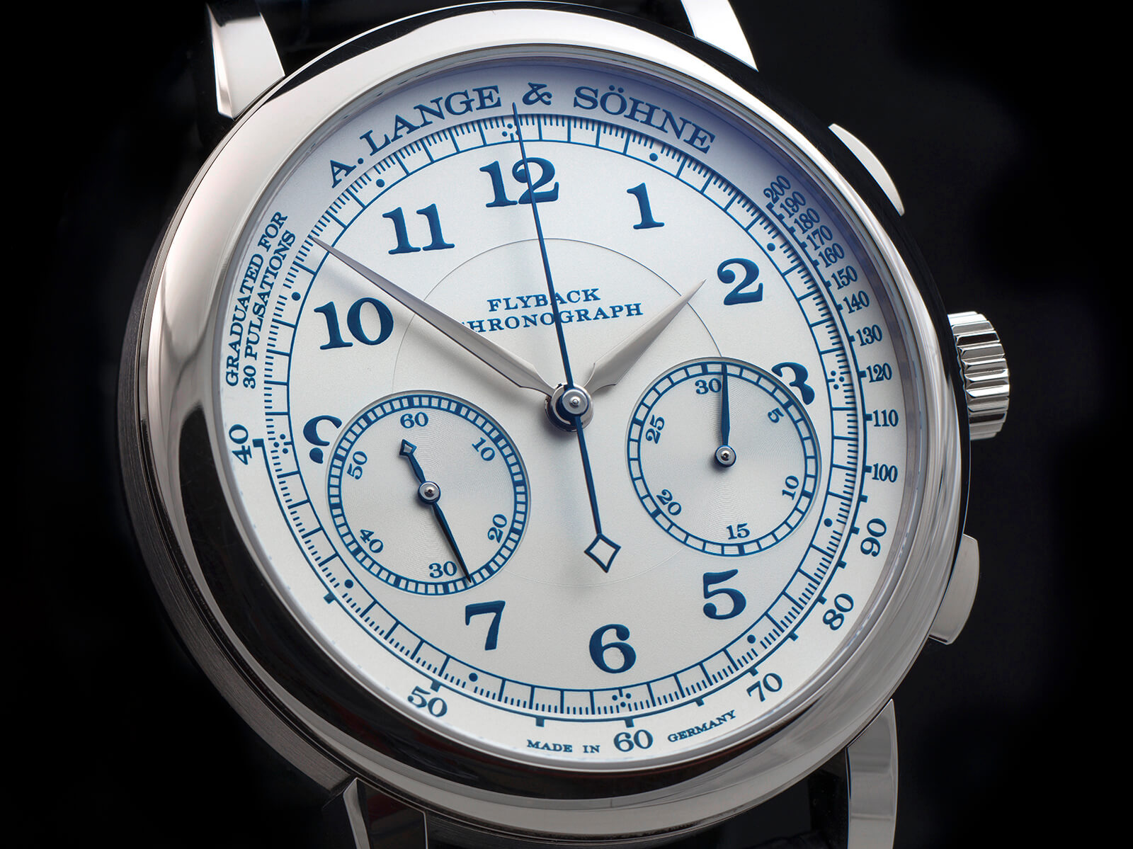
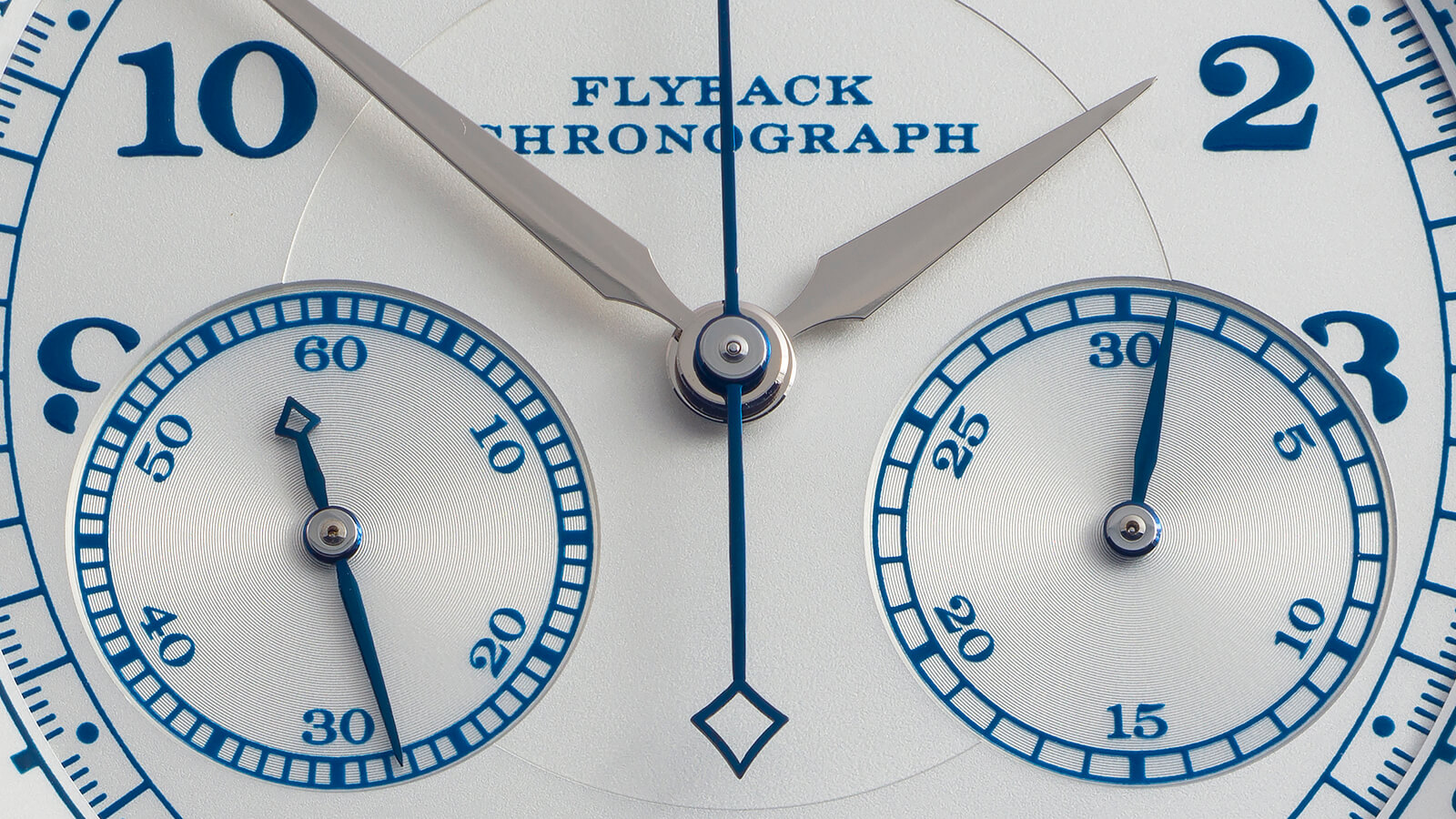
No piece of cake to shoot: tough-to-capture blue-on-white of the 1815 Chronograph Boutique Edition
In the event, it turned out to be pretty much the opposite! While the visual elements including the rhodium-plated gold hands on the Boutique Edition were quite distinct visually, the dial itself tended to exhibit a confounding array of color casts, from cyans and greens near the perimeter of the dial to odd yellowish tones within the shadows that the main hands throw on dial.
I corrected some of this in post-processing to make the images look as much like the actual watch as possible, but at the same time I didn’t want to desaturate the images so much that the subtle colors that are there vanish into a seemingly white-on-platinum rendering.
Closer, better: dial detail, A. Lange & Söhne 1815 Chronograph
Closer shots like the one above were somewhat easier to manage and provide a clearer impression of the creamy color of the dial, sky-blue markings, and subtle surface treatments.
By contrast (literally and figuratively) the camera (in this instance the Hasselblad X1D) absolutely loved the black/silver/white tones of the other watch.
—————————————————————————————————–
Credits: Article and images by Ian Skellern @ Quill & Pad. See the original article here - https://quillandpad.com/2024/10/05/behind-the-lens-two-1815-chronographs-from-a-lange-sohne-3/