Credits: Article and images by Raman Kalra @ Quill & Pad. See the original article here - https://quillandpad.com/2023/11/03/christopher-ward-the-twelve-in-depth-review-the-science-of-relatively-affordable-perfection/
————————————————————————————
Dial
The watch comes in two case sizes and offers various color options on the dial. As for the titanium models, only two colors are currently available: Astral Blue and Nebula Purple.
These colors feature fumé dials that gradually fade into black around the outer edge. Before receiving The Twelve, I had already dismissed liking this reference as something for my collection because of the color.
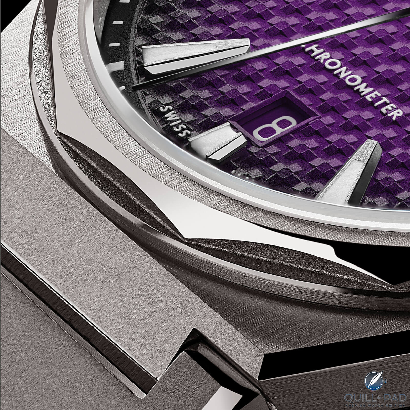
Christopher Ward The Twelve dial closeup
I usually prefer simple, understated watches that go with everything, and purple didn’t seem to fit that equation. You can probably see where this is going. After I received The Twelve and saw it in person, my opinion completely changed.
The purple is less intense than it appears in the marketing images, especially in indirect light, and the fumé design looks amazing. I have been converted, and while it may not be my first choice for dial color, it has definitely moved up on my list.
Overall, The Twelve undeniably shares some resemblance with other great watches out there. I can find elements of the Omega Aqua Terra, GP Laureato, Zenith Defy and, of course, Genta-designed pieces.

Czapek Antarctique
However, you may notice that above all, it resembles the Czapek Antarctique closest. You are not wrong. Adrian Buchmann, the head of product design at Christopher Ward, was credited as one of the main designers behind the Antarctique.
There are different ways you can view this and form an opinion. Perhaps you find The Twelve to now fall into a homage category to the Antarctique, or you could appreciate it as the younger brother to the far more unattainable Czapek. I fall into the latter category.
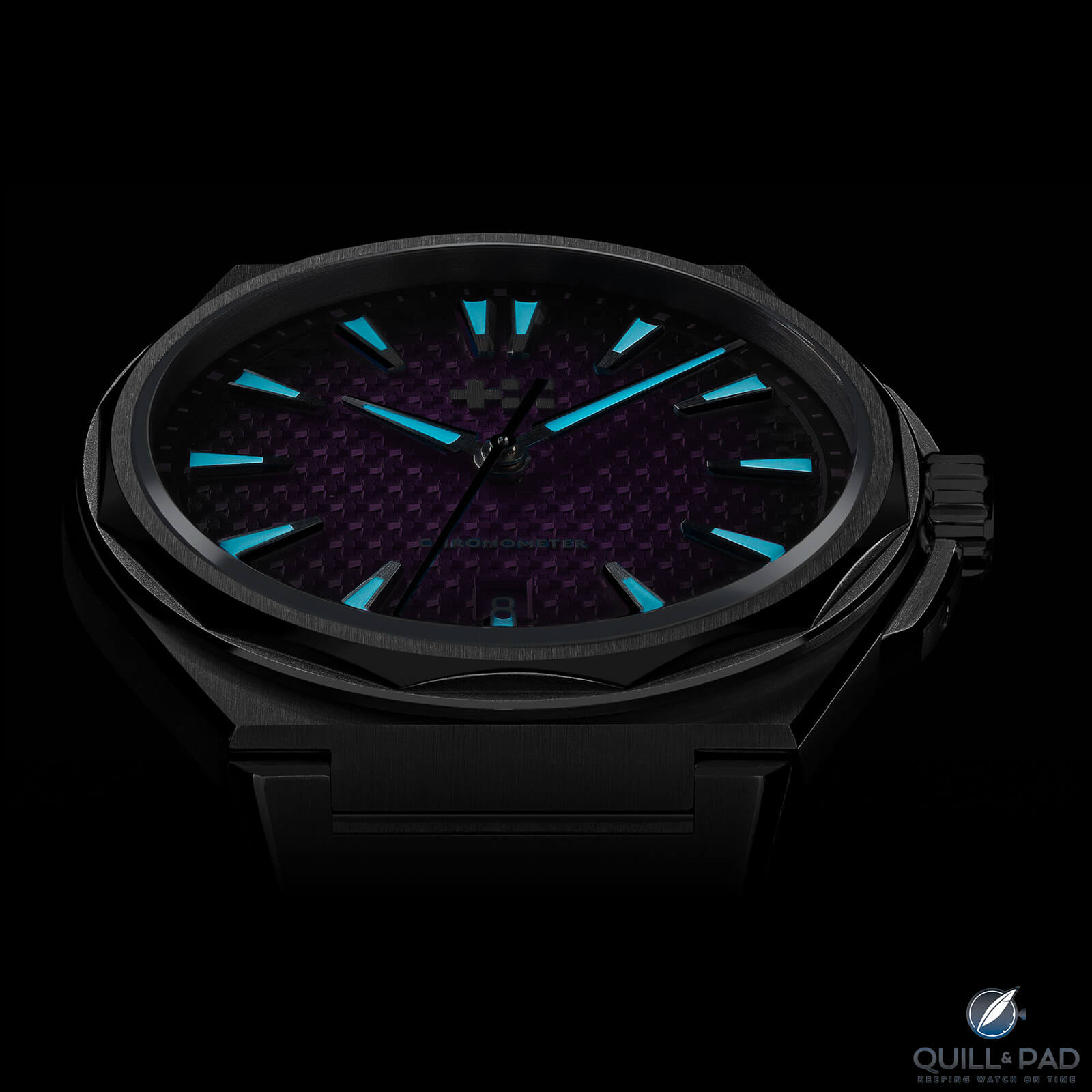
Christopher Ward The Twelve lume
To me, the poetic angle is similar to what Genta did by taking his designs from one brand to another with minor adjustments. It is not in the same league by any means, but you can appreciate the idea.
Christopher Ward has followed the typical formula for this style of watch by including a textured dial. Zoom in close enough and you will notice the dial design motif is the twin-flags Christopher Ward logo repeating.
On a daily basis, the texture adds to the dynamism of the watch and gives it a premium feel. This, however, is the first area where I think there is room for improvement.
The texture is very harsh and for two reasons I would like to see this change going forward. Firstly, in my opinion, it feels over-styled. There is a lot to catch your attention and The Twelve already has many sharp edges and strong design features.
Secondly, when the texture catches the light, it makes the watch less legible.
While I don’t mind it, I don’t love it and would like to see a flat dial variant added or the texture toned down in future models.
————————————————————————————
Credits: Article and images by Raman Kalra @ Quill & Pad. See the original article here - https://quillandpad.com/2023/11/03/christopher-ward-the-twelve-in-depth-review-the-science-of-relatively-affordable-perfection/