Credits: Article and images by @ Quill & Pad. See the original article here - https://quillandpad.com/2023/12/02/why-i-bought-it-c-by-romain-gauthier-titanium-edition-two-reprise/
————————————————————————————–
Any quibbles?
The perfect watch has not yet been made! I’m extremely pleased to have this one in my collection, but in the perfect (for me) world I’d change a few small things.
While I quite like the idea of using red luminous markers, the sad fact is that red is the dimmest Super-LumiNova color – about a fifth the luminous intensity as some of the brightest variants used by brands like Rolex as shown in the table below.
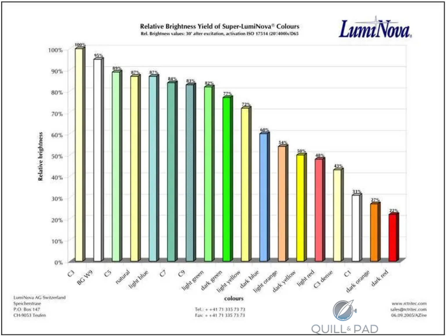
Super-LumiNova intensities by color (image courtesy LumiNova AG)
Even zapped with a high-intensity UV flashlight, the red is dark enough that I had trouble capturing it in a photo; what you see below is a lot whiter – and brighter – than what I see with my naked eye.
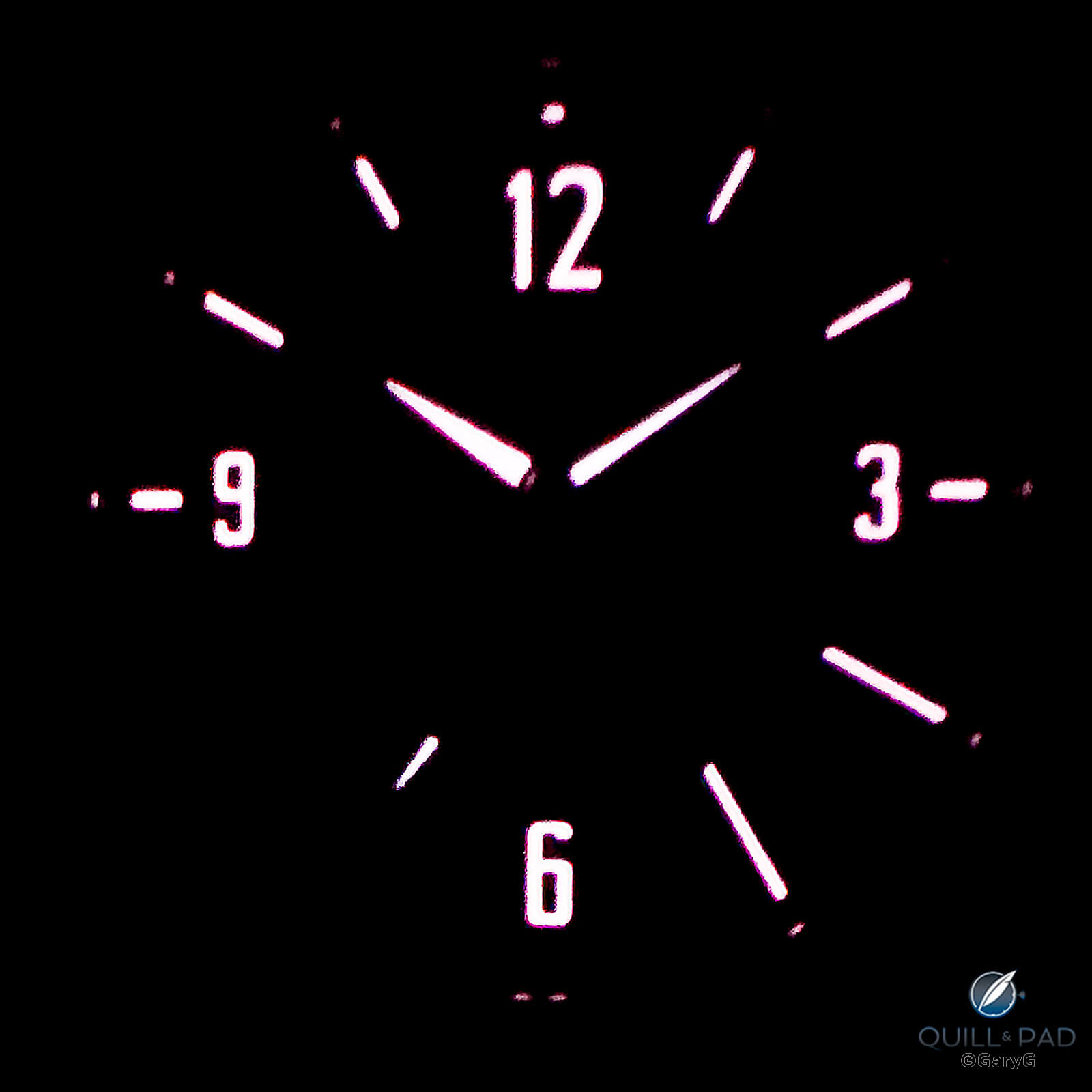
Lume view, C by Romain Gauthier Titanium Edition Two
As long as I’m being picky, the quail-topknot tip of the “h” in Gauthier that extends from the printed logo toward 1 o’clock often at first glance looks like a bit of dust to be swept off; I like the decision to keep Gauthier’s traditional logo for C but wonder if something might have been done with its size or placement.
I earlier praised the crown position, and Gauthier says that one objective was to make the watch more comfortable on the wrist as with some of his other references: the only bad news is that I have a prominent bone on my wrist up by 2 o’clock and while I don’t feel the crown hitting it, a visible depression red line does form on my skin.
Finally, all things equal I’d prefer an actual serial number on my movement to the “1 of 38” notation that adorns all the watches in this limited series, but I do understand that it’s a pain to manage all the specific requests for buyers’ special numbers and it’s not a big deal to me.
Final thoughts
Especially for a small independent, it takes real courage to move in a new direction. We’ve seen “sport” watches from other indies recently, but none of those have moved as dramatically in terms of visuals, materials, design, and movement architecture from their makers’ prior work as does the C series from Romain Gauthier.
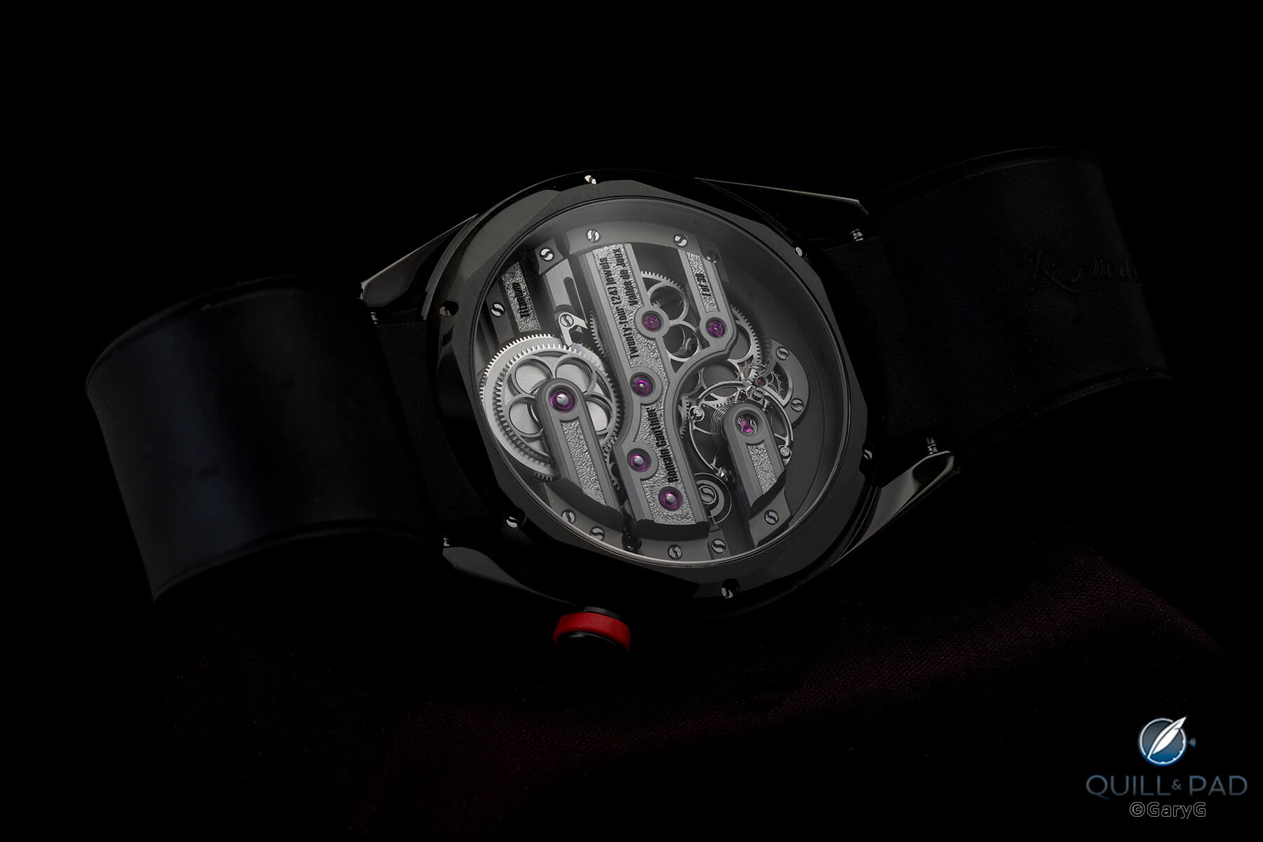
Rear view, C by Romain Gauthier
At the same time, Gauthier has done a splendid job, in my view, of maintaining links to both his own past and to the traditions of the Vallée de Joux with C and has tapped his unique competence among the indies in highest-quality micro-machining and material science to give us watches that only he can make.
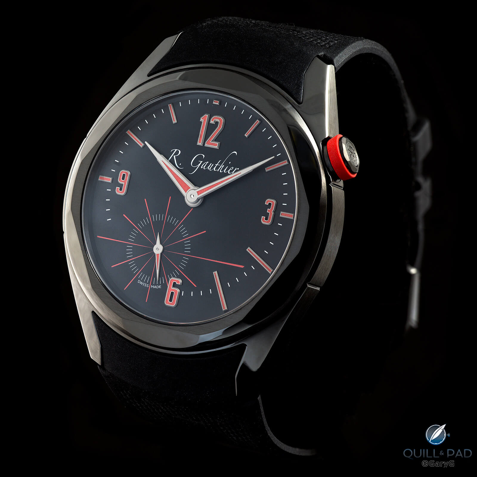
Parting shot: C by Romain Gauthier Titanium Edition Two
I’ll look forward to reading your comments on this watch and on other sports watches by independents. In the meantime, happy wearing!
For more information, please visit www.romaingauthier.com/heritage/c-romain-gauthier.
Quick Facts C by Romain Gauthier Titanium Edition Two
Case: 41 x 9.55 mm, Grade 5 titanium case coated with black ADLC; polished and brushed beveled bezels, polished lugs, and brushed case band; anti-reflective front and rear sapphire crystals; crown at 2 o’clock with red rubber ring
Dial: frosted titanium dial with ADLC and anti-UV coatings; Arabic and baton indices in white gold with red Super-LumiNova; printed minutes, seconds, and logo
Movement: manually wound in-house movement in titanium; extensive hand finishing; 60-hour power reserve; 28,800 vph/4 Hz frequency; hacking seconds governed by snail cam
Functions: hours, minutes, hacking offset subsidiary seconds
Limitation: 38 examples
Price: $43,700
Production years: 2022-2023
* This article was first published 17 December 2022 at Why I Bought It: C By Romain Gauthier Titanium Edition Two
You may also enjoy:
C By Romain Gauthier: A Continuum of Lifelong Learning
Watchmaker Of Historical Significance: Romain Gauthier
Why I Bought It: Romain Gauthier Logical One
Credits: Article and images by @ Quill & Pad. See the original article here - https://quillandpad.com/2023/12/02/why-i-bought-it-c-by-romain-gauthier-titanium-edition-two-reprise/