Credits: Article and images by Saad Chaudhry @ Quill & Pad. See the original article here - https://quillandpad.com/2024/10/24/why-i-bought-it-omega-seamaster-aqua-terra-150m-2/
—————————————————————————————————–
Omega Seamaster Aqua Terra 150M: dial and hands
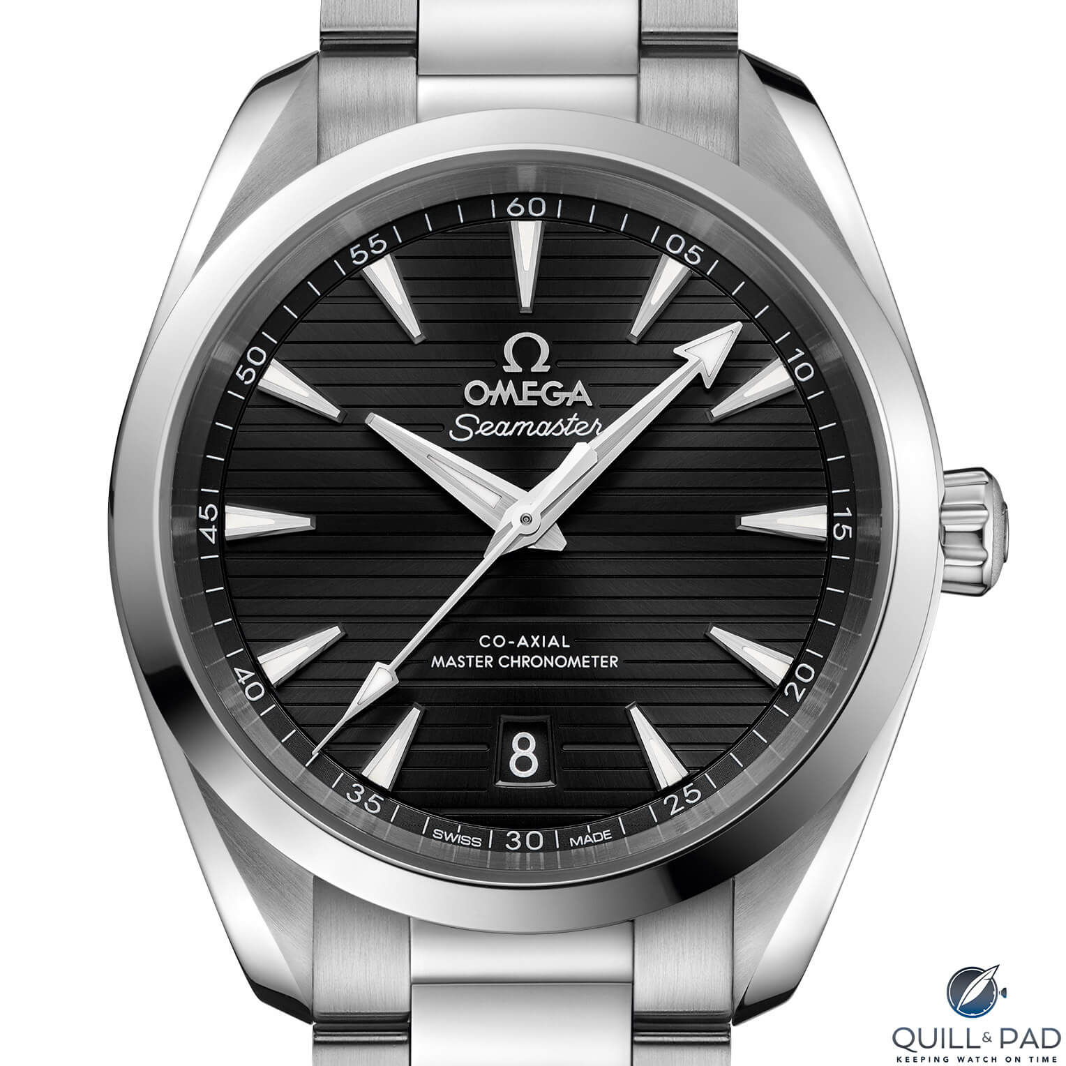
The Omega Seamaster Aqua Terra 150M dial features latitudinally engraved furrows of intermittent depth streaked across the three-dimensional dial. A rich lacquer and metallic sunburst finish in the central dial leads the eye to hour indices resembling the prow of a yacht. Radially aligned, trapezoidal and tall, the indices proudly display their faceted bows with polished sides and vertically brushed top surfaces.

Dial of the Omega Seamaster Aqua Terra 150M
The hands and indices are Super-LumiNova filled, while the metallic dial reflects off the sides of each like a distant mirage.
The dial imparts a calmness to the Aqua Terra not present in previous models that I ascribe to the horizontal lines on the dial.
The calmness, a feeling of being grounded, is enhanced by the gently domed sapphire crystal held in place by a highly polished conical bezel. The dial’s applied Omega logo, vertically brushed on top and polished along the sides, sits proudly below the single 12 o’clock hour index (a double index would have been delightful here in my opinion).
Dial text is surprisingly terse, reduced to announcing it’s a Seamaster with a technically advanced co-axial escapement and Master Chronometer certification. At 6 o’clock is a well-executed precision-cut date window with bevels extending all the way down to the date disk. And I’m particularly pleased that the date disk matches the color of the dial.
Although slim, the date (in Futura font like the minute numerals) is highly legible.
The dial’s “teak deck” pattern consists of “planks” with shallow spacing between each and a wider furrow between every three. This both generates interesting and deep shadows and creates margins for visual mass to decentralize and expand outward, creating the impression of a larger dial. This rhythm allows the dial to be enjoyed like a lyric rather than mere graphic field.
The hands are a wonderfully multifaceted affair.
The long and thin second hand, bisected and polished with a spearhead lume plot, reaches comfortably into the minute track markings. The pentagonal counterbalance is the same length as the spearhead.
The minute hand contains three surfaces with the leading and trailing edges polished and a plateaued central column brushed along its length. Ditto the hour hand.
The minute hand boasts an arrowhead at its tip, broad and squat, and entirely filled with lume. The lume on the hour hand is within its central body.
The shape of the hands is dauphine in concept but freshened to reflect the watch’s modern sporting credentials and production techniques. The breadth of the hour hand’s terminal is the same as that of the hour indices.
—————————————————————————————————–
Credits: Article and images by Saad Chaudhry @ Quill & Pad. See the original article here - https://quillandpad.com/2024/10/24/why-i-bought-it-omega-seamaster-aqua-terra-150m-2/


